
Selectable Theme
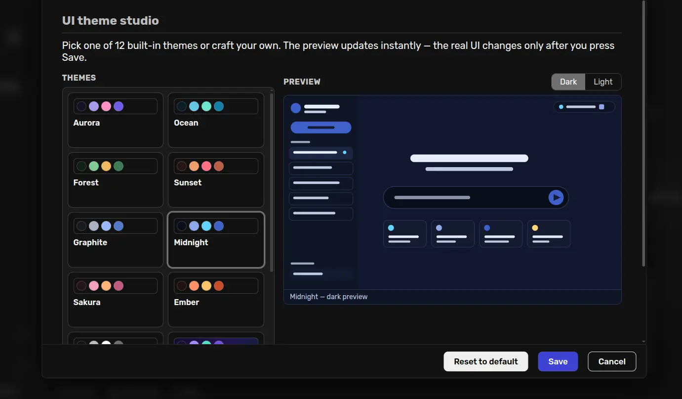
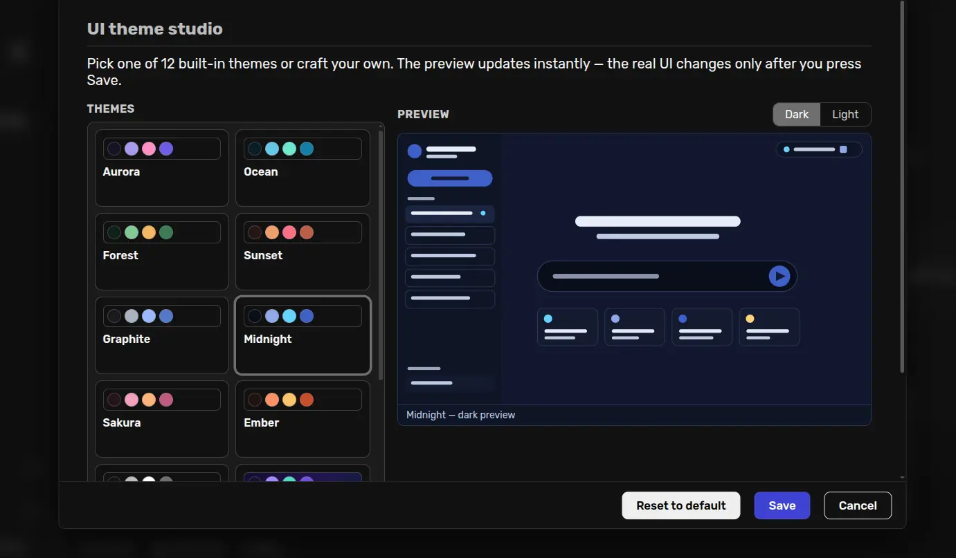
Select and preview 12 semantic WebUI themes, then create reusable custom light/dark palettes and gradients without modifying Agent Zero core.
Screenshots
README
Selectable Theme
A theming studio for the Agent Zero WebUI. Overrides the framework's semantic color tokens without touching any core file, keeps the native light/dark mode behavior intact, and now includes a live preview and a custom theme builder.
Features
- Live SVG preview — an inline SVG mock of the Agent Zero UI (sidebar, chat list, greeting, input bar, quick-action cards, status area) recolors instantly when you click a theme. It has its own light/dark toggle (defaulting to your current mode) and does not change the real UI until you press Save.
- 12 built-in themes rendered as a responsive swatch grid, each with full dark and light variants covering all 17 semantic tokens.
- 3 gradient themes that apply a fixed CSS gradient to the page background
(
--st-gradient) while panels/messages stay solid or semi-transparent for readability. - Custom theme builder — name a theme, start from any built-in (or custom)
base, edit every token for both modes with color + free-text inputs (any CSS
color works, including alpha hex like
#62598aa8), optionally add a 2–3 stop gradient with an angle, then save/update/duplicate/delete. Custom themes appear in the grid alongside built-ins.
Theme list
| Theme | Id | Gradient |
|---|---|---|
| Aurora (default) | aurora |
– |
| Ocean | ocean |
– |
| Forest | forest |
– |
| Sunset | sunset |
– |
| Graphite | graphite |
– |
| Midnight | midnight |
– |
| Sakura | sakura |
– |
| Ember | ember |
– |
| Monochrome | monochrome |
– |
| Nebula | nebula |
✔ |
| Solar Flare | solar-flare |
✔ |
| Synthwave | synthwave |
✔ |
Config schema
# default_config.yaml / stored config.json
theme: aurora          # builtin id or custom theme id (custom-*)
custom_themes: []      # array of custom theme objects
Custom theme object:
{
  "id": "custom-my-theme",
  "name": "My Theme",
  "dark":  { "background": "#151225", "text": "#f4f0ff", "...": "all 17 tokens" },
  "light": { "background": "#fbf9ff", "...": "all 17 tokens" },
  "gradient": { "enabled": true, "angle": 135, "stops": ["#120c2c", "#241452", "#0b2038"] }
}
The 17 token keys (mapped to --color-<key>): background, text,
text-muted, primary, secondary, accent, message-bg, highlight,
message-text, panel, border, input, input-focus, chat-background,
error-text, warning-text, table-row.
Backward compatibility: legacy configs like {"theme": "ocean"} keep working;
a missing custom_themes defaults to [], and unknown theme ids fall back to
aurora.
How themes are applied
webui/theme-data.js— single source of truth: the 12-theme registry, token metadata, and helpers (validation, slugify, gradient/vars/CSS generation). Exposed to the settings page viawindow.SELECTABLE_THEME_DATA.webui/themes.css— pre-generated token layers for the built-ins, scoped asbody[data-selectable-theme="<id>"].dark-mode { ... }/.light-mode. Generated fromtheme-data.js; keep both in sync manually when editing.webui/theme-runtime.js— loadsthemes.css, validates the configured id against built-ins plus storedcustom_themes, setsdata-selectable-themeon<body>, and — for custom themes — injects a<style id="selectable-theme-custom">element with generated body-scoped rules built from the stored config.extensions/webui/initFw_end/bootstrap-theme.js— applies the persisted config (full object, so custom CSS is injected) on page load.extensions/webui/fetch_api_call_after/refresh-theme.js— re-applies live after a successfulsave_config(using the full saved settings) and applies/clears ontoggle_plugin.webui/config.html— the settings studio (preview + grid + builder). The preview binds theme variables inline on a wrapperdivwhose background isvar(--st-gradient, var(--color-background)); the SVG shapes are filled withvar(--color-*), so gradient themes render their gradient behind the transparent-capable surfaces.
Usage
- Enable the plugin: Settings → Agent → Plugins → Selectable Theme.
- Open its settings, pick a theme (or build one), watch the preview.
- Press Save — the theme applies to the real UI immediately.